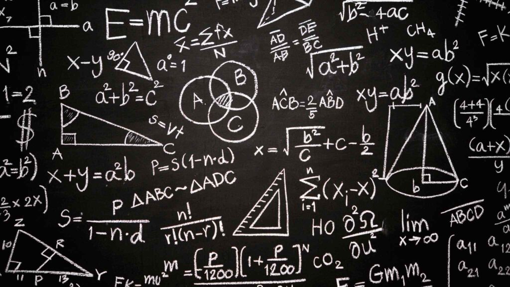
Have you ever wondered how math is used in graphic design? It may seem like a strange question, but believe it or not, math is a huge part of this field! It is used in virtually every step of the design process. In this blog post, we will discuss how math is used in graphic design and provide examples to help illustrate our point. We hope you find this information helpful and exciting!
1. Create perfect proportions and compositions in designs
Aesthetics are essential in graphic design, but achieving the right look is not simply following your eye. To create stunning designs, graphic designers must have a strong understanding of mathematics. Proportions and symmetry play a role in everything from the structure of letterforms to the layout of a page, and visualizing relationships between numbers is essential for creating harmonious compositions. In addition, many popular design software programs use mathematical algorithms to generate complex patterns and shapes. By harnessing the power of math, graphic designers can create stunning visual effects that would be impossible to achieve by hand.
2. Use Geometry to create shapes and lines that are visually appealing and effective
Designers often rely on geometry to create shapes and lines that are visually appealing and effective. By understanding the principles of geometry, designers can create patterns, silhouettes, and other design elements that are eye-catching and functional. For example, using circles and curves can add a sense of movement to a design, while Angular shapes can create a sense of stability. In addition, the placement of lines and conditions can also affect a design’s overall look and feel. By carefully considering the geometry of their structures, designers can create aesthetically pleasing and structurally sound compositions.
3. Calculate spacing between different elements in a design
Creating a well-balanced and visually appealing design is often a matter of careful spacing. Too much space and the format can appear cold and uninviting, while too little space can make it feel cramped and cluttered. However, the right amount of space can give a design a sense of harmony and order. But how do you know how much space to leave between different elements in your design?
A few general rules of thumb can help you achieve the perfect balance. For instance, try to maintain an even margin around the perimeter of your design. You can also use the “rule of thirds” to create visual interest by breaking up your design into thirds, both horizontally and vertically. Another helpful trick is to use negative space to create balance – for example, by placing a significant element in the center of your design and then positioning more minor elements around it. By taking the time to calculate the spacing between different components in your design, you can create a polished and professional look.
4. Typography is also affected by mathematical principles
Typefaces are not just a product of creative minds but careful mathematical calculation.
The shapes of the letters are determined by precise equations that govern everything, from the thickness of the strokes to the curvature of the curves. Mathematical formulas govern even the spacing between letters. As a result, every typeface has its unique personality and feel. And while computer programs have made it easier to create new typefaces, the underlying principles remain the same. So next time you’re admiring a beautiful font, remember that there’s a lot of math behind its good looks.
5. Making sure all the text in a design is aligned correctly
Math in graphic design is often overlooked, but it is an essential part of the design process. Ensuring all the text in a format is appropriately aligned ensures that the final product looks clean and professional. Text that is not aligned correctly can look sloppy and unprofessional and be very difficult to read. Math comes into play when determining the perfect alignment for text elements. For example, the centered text usually looks best when the left and right margins are equal. Justified text looks best when the left and right margins are different, but both are still flush with the edge of the page. By ensuring that all the text in a design is aligned correctly, you can create a polished, professional-looking final product.
6. By understanding how math works behind graphic design, you can create better-looking designs yourself!
As a graphic designer, math is your friend! By understanding how to use basic math concepts, you can create more visually appealing and balanced designs. For example, the rule of thirds is a simple but effective way to add interest to a structure. This rule states that an image should be divided into thirds, both horizontally and vertically. Placing the image’s subject at one of the intersections creates a more dynamic composition. Another helpful tool is the Fibonacci sequence, which can create pleasing proportions in a design. The series begins with 0 and 1, and each subsequent number is the sum of the previous two. For example, the next number in the arrangement would be 1+0=1, followed by 1+1=2, 2+1=3, 3+2=5, and so on. Applying this sequence to a design can help to create a sense of harmony and visual interest. So next time you sit down to design something, remember that a little bit of math can go a long way!
Conclusion
So far, we’ve looked at how adding math to your design can improve the overall aesthetic and make your designs more accurate. But there are other reasons to love math in graphic design. For example, did you know that using simple math concepts can create optical illusions? Next time you want to add a little extra pizzazz to your work, try incorporating some basic geometry or trigonometry. The results might surprise you! Have you ever used math in your graphic design projects? If so, what kind of results did you achieve? Let us know in the comments below.